Static Choices: Creating Selections Manually
The Choices element enables a user to select an answer from a list of alternatives displayed to them.
For example, you can ask customers to select a color for a product that they ordered, or indicate their nearest store location. You can also add personalized Rules to your choices that will determine if and when a particular choice is displayed.
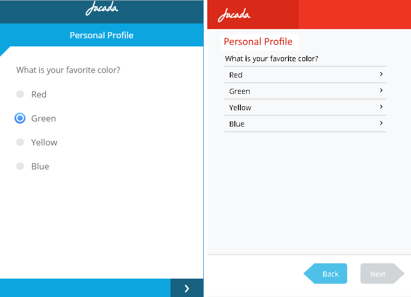
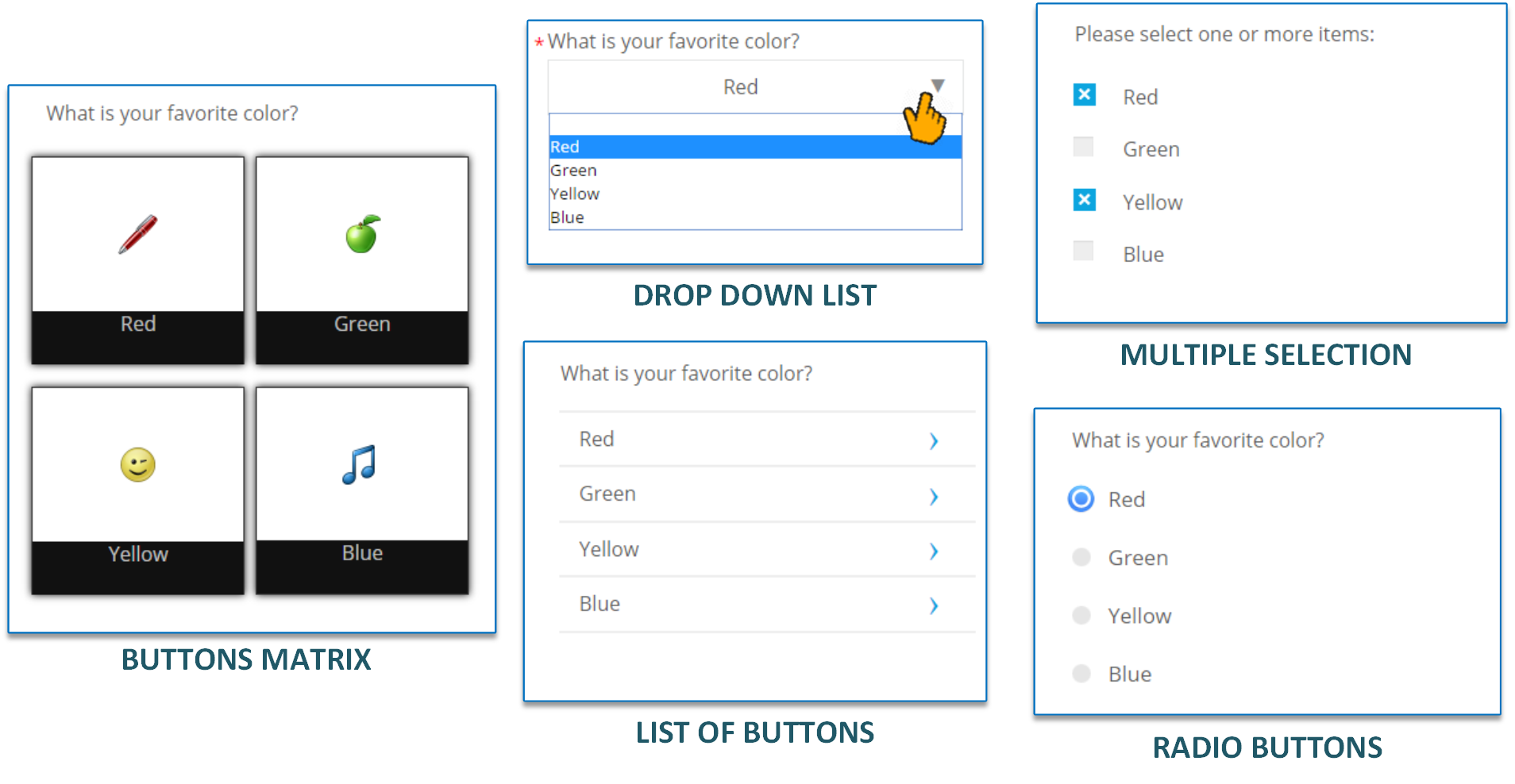
Choice questions can also be presented using one of several display types. For example, your question might look like one of the following to customers:
 |
This article describes how to design questions with static choices that you input manually when you create the Choices element.
Create a Static Choice List
From the left side of the Page Editor, select the Choices element, and drag it to the Page map. On the right side of the Page Editor, the Element tab will open.
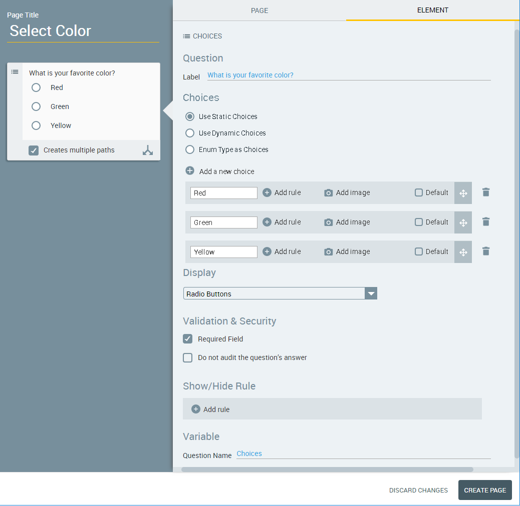
In the Label field of the Element tab, enter the text of the question.
Select the Use Static Choices radio button. (When creating a new element, this option is selected by default.) A set of three default choices is displayed.
In the rows of choices, replace the default answers (Red, Green and Yellow) with answers that are relevant to your question.
To assign an image for a choice, click the Add Image
 icon. The Insert Image dialog is displayed.
Browse and select the image you want to insert and then click Use Image. A preview of the image will appear in the row, in place of the Add Image icon.
After an image has been added to the choice, you can use Edit image to change or clear the image assignment.
Note
The X-Designer supports inserting images that are stored on the X‑Platform Server in a dedicated Image Library. For details about how to add images to your Library using the X-Console, click here.
To assign an Account Rule to a specific choice, click the Add rule
 icon. For more details, see Personalizing Choices with Rules.
Create new choices as required:
From above the choices list, click the Add new choice
icon. A new blank row will be added to the choices list and to the Page map.In the new row in the choices list, enter the text of the new choice. The new answer will automatically be added to the Page map on the left.
Repeat the Steps above until your choice list is complete.
To arrange the choices list in the desired order, use the Rearrange
 icons on the far right side of each choice to drag and drop the choices into the order that you require.
If desired, specify a default answer by selecting the Default checkbox on the right side of the relevant choice. (Note that this option is not available for all Display formats.)
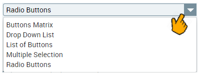
In the Display section, use the dropdown menu to select the format in which the choices will be displayed. For examples of available formats, see Display Options for Choices.
Note
Selecting certain formats may change the information required to complete the Choices panel.
When using the Drop Down List Display format, you can optionally activate the Add autocomplete search checkbox. This enables the user to enter text in a searchbox at the top of the List and view only those choices which match their text (or any portion of it):
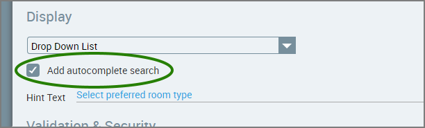
This is especially useful when the List contains many items.
In the Hint Text field below the checkbox, you can optionally add a helpful Hint that will appear in the searchbox.
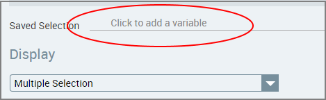
When using the Multiple Selection Display format, press '@' in the Saved Selection field to select (or create) a variable that will be used to store the user's response.
Note
For more details on creating a Multiple Selection list using Dynamic Choices, click here.
Configure the validation and security settings. If relevant, select the Required Field checkbox and/or the Do not audit the question's answer checkbox. For more information, refer to Choice Question Design: Basic Workflow.
The Show/Hide Rule field enables you to show or hide the input question during runtime if a specified Rule condition is met. (An input question is always displayed by default.) To add a Show/Hide rule, click the Plus
 icon and enter the condition to meet using the Rule Editor that appears:
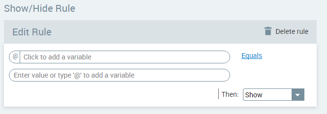
After adding the condition, select Show or Hide from the dropdown menu at the lower right to set the question's display status. To delete a Rule, click Delete rule at the top right corner of the Rule Editor.
For more details and an example, click here.
The Question Name field stores the runtime response as a User Input variable in order to make it readily available to other Flow elements. (For details on using choice selections in variables, see Using Choice Selections in Other Elements.) A unique name is automatically assigned by default, but you can enter a more descriptive name of your own.
Note
When using the Multiple Selection Display format (see above), the Saved Selection field is used to store the user's runtime response.
To save your changes, at the lower right corner of the Page Editor, click Update Page. The Page Editor closes, and the Flow Map is displayed.
Display Options for Choices
You can display your Choice list in a variety of formats. The Display section provides a dropdown list with the options available to you. Below are examples for each of the format available. (Click the image to see a larger version.)
 |
When selecting certain Display formats for Choices, you can also design their workflow options. Available options will appear as checkboxes beneath the Choice display in the mapping area:
Creates multiple paths. This Choice question will be used as the basis for more than one exit point.
Clicking here proceeds to the next page. Following the user Choice selection, the workflow will continue to the following page in the Flow.
In the mapping area, select the checkboxes that are appropriate for your workflow.
When displaying a Drop Down List, you can optionally provide the user with an autocomplete function, enabling them to enter text in a searchbox at the top of the List and view only choices which match the text or any portion of it:
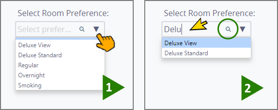
This is especially useful when the List contains many items.
Personalizing Choices with Rules
When building a choice list, you can add Rules to personalize the specific choices that will be displayed to the user. A Rule can use any variable that is available to the Flow.
For example, you may want to present a specific choice only to a premium customer, or hide a choice from users on specific days of the week. You can add a personalized Rule to any choice.
You can create a Rule that is local to the current choice, or use a global Rule. For more information on global Rules, see Creating Account Rules.
In the choice you wish to personalize, click the Add Rule
icon. A Rule editor will be displayed for that choice.Click in the left-side variable field, and do any of the following:
Select a variable or formula from the Variables List
Select a global Rule to use from the Variables List, or
Create a new variable (for instructions, refer to Creating User Variables).
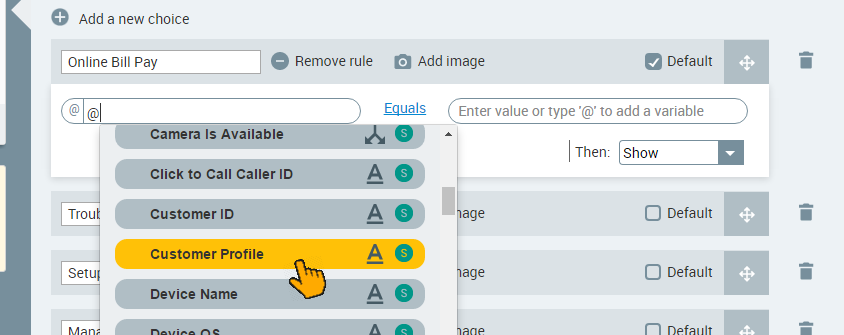
Select the required comparison logic (equals, less than, etc.) to be used in evaluating the conditions. The comparison logic options will change according to the selected variable type.
Click in the right-side field and determine the value to compare against:
Enter "@" then select a variable from the Variables list
If you are using a global Rule, select one of the Rule outputs that appear in the drop-down list
Create a new variable, or
Enter a set value
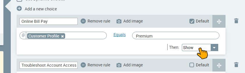
Select Show or Hide. When the Rule condition is met, this value will determine whether the choice is displayed to the user.
To remove a Rule, click on Remove rule to the right of the choice's name.