Dynamic Choices: Creating Selections Using Collections
Dynamic choices enable you to present a choice list that is populated in runtime with the values contained in a specified collection.
You can build Dynamic choices using either:
Simple type collections (collections of primitive variable types)
Object type collections (collections of Custom Types)
When using Dynamic choices, the list that is displayed enables the user to choose a single value or choose multiple values, depending on the Display Format that is assigned:
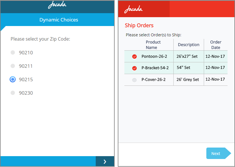 |
Above on the left is an example radio button list populated by a single field from a simple type collection. On the right is an example multiple selection list populated by a set of fields from an object type collection (using a Custom Type).
Creating Dynamic choices uses the following basic workflow:
Selecting the collection that is used to populate the choice list.
Specifying an appropriate variable to store the user's answer.
Selecting one or more fields from which the choice list is built (performed when using Custom Types only).
Selecting the choices display option to use.
Create a Dynamic Choice List with a Single Selection Field
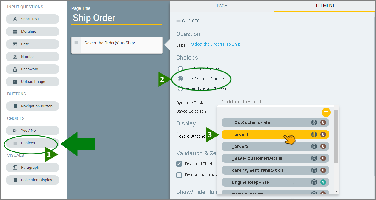
From the left side of the Page Editor, select the Choices element, and drag the element to the Page map. On the right side of the Page Editor, the Element tab opens.
In the Label field of the Element tab, enter the text of the question.
Select the Use Dynamic Choices radio button. The Dynamic choices settings are displayed.
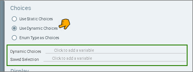
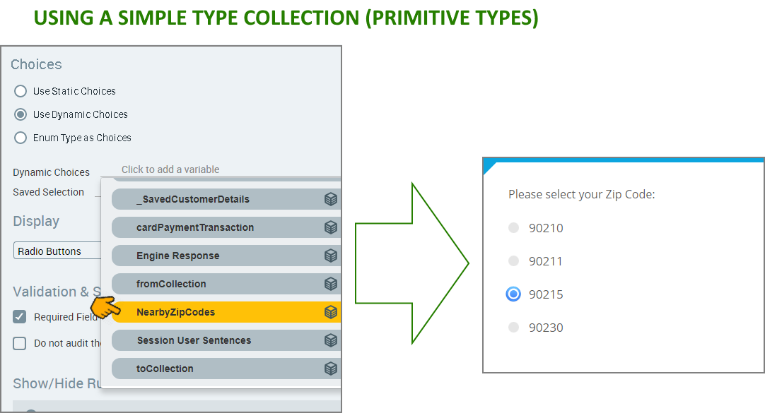
Click in the Dynamic Choices field, and select the collection that will be used to populate the choice list.
A single selection menu example based on a collection of primitive types is shown below:
A single selection menu example based on a collection of Custom Types is shown below:
Click in the Saved Selection field, and select the variable that will hold the user selection.
Note
Only variables whose types match the collection type selected are displayed (e.g., if you have chosen an object type collection, only variables based on that object type collection are displayed). If no variables are displayed, you can create a new variable that is of the appropriate type.
In the Display section, use the dropdown menu to select the format in which the choices will be displayed. For examples of available formats, see Display Options for Choices.
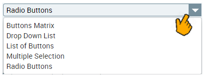
The Display format you select also determines the value type of the Saved Selection field, since it needs to match the type of user response expected (in this case a single value). If you change the Display format, you may need to re-select the Saved Selection variable.
When selecting certain Display formats for Choices, you can also select whether to proceed to the next page following the user selection. This option will appear as a checkbox beneath the selected Choice display in the mapping area. Select the checkbox if it is appropriate for your workflow.
Configure the validation and security settings. If relevant, select the Required Field checkbox and/or the Do not audit the question's answer checkbox. For more information, refer to Choice Question Design: Basic Workflow.
The Show/Hide Rule field enables you to show or hide the input question during runtime if a specified Rule condition is met. (An input question is always displayed by default.) To add a Show/Hide rule, click the Plus
 icon and enter the condition to meet using the Rule Editor that appears:
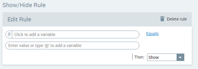
After adding the condition, select Show or Hide from the dropdown menu at the lower right to set the question's display status. To delete a Rule, click Delete rule at the top right corner of the Rule Editor.
For more details and an example, click here.
The Question Name field stores the runtime response as a User Input variable in order to make it readily available to other Flow elements. (For details on using choice selections in variables, see Using Choice Selections in Other Elements.) A unique name is automatically assigned by default, but you can enter a more descriptive name of your own.
To save your changes, at the lower right corner of the Page Editor, click Create Page (or Update Page). The Page Editor closes, and the Flow Map is displayed.
Create a Dynamic Choice List with Multiple Selection Fields
When you build a Multiple Selection list from a object type collection (using a Custom Type), the user can select more than one answer, and their response is stored in a collection variable.
From the left side of the Page Editor, select the Choices element, and drag the element to the Page map. On the right side of the Page Editor, the Element tab opens.
In the Label field of the Element tab, enter the text of the question.
Select the Use Dynamic choices radio button. The Dynamic choices settings are displayed.
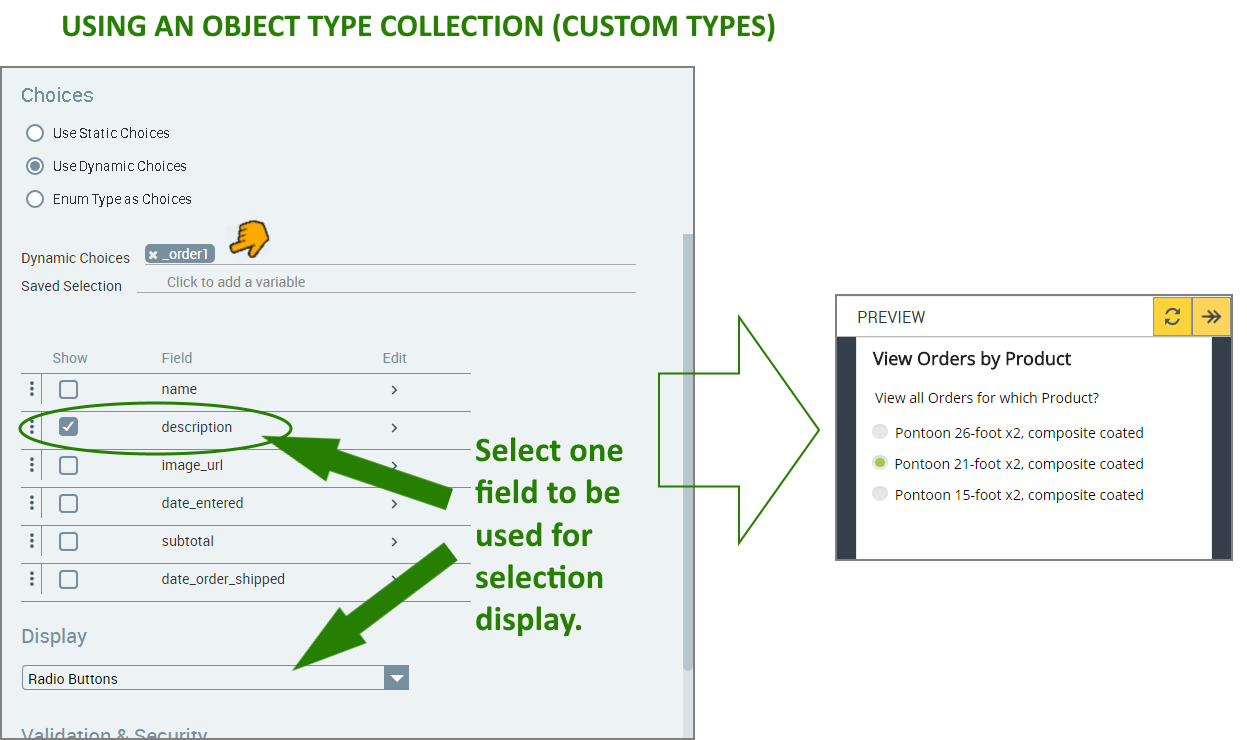
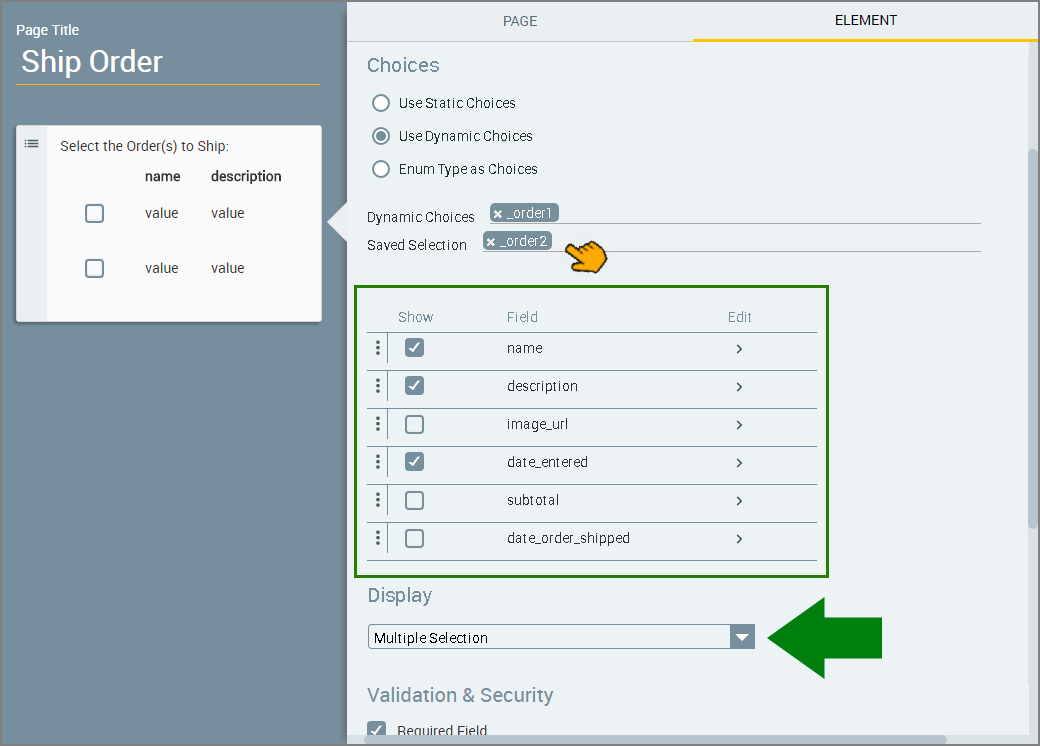
Click in the Dynamic Choices field, and select the collection that will be used to populate the choice list:
After your selection, all of the fields from the collection you are using will be displayed as a table in the Choices section.
In the Display section, use the dropdown menu to select the Multiple Selection option.
The Display format you select also determines the value type of the Saved Selection field, since it needs to match the type of user response expected. If you change the Display format, you may need to re-select the Saved Selection variable.
Click in the Saved Selection field, and select the collection that will store the user's response.
Note
Only variables whose types match the collection type selected are displayed (e.g., if you have chosen an object type collection, only variables based on that object type collection are displayed). If no variables are displayed, you can create a new variable that is of the appropriate type.
Specify the field(s) to be shown in the choice list: In the Show column, clear the checkboxes of the fields that should be hidden. Note: If you specify only a single field, the resulting runtime menu will be similar to the choice menu that is displayed for simple type collection, however the user will be able to select multiple values from the menu.
Designate the order in which the selected fields will be displayed. In the fields list, use the
 icon at the left of each row to drag and drop the rows of the selected fields into the desired order.
Design how field names and values will be displayed:
At the right side of the row of the field you want to edit, click the right angle bracket icon. The field editor is displayed.
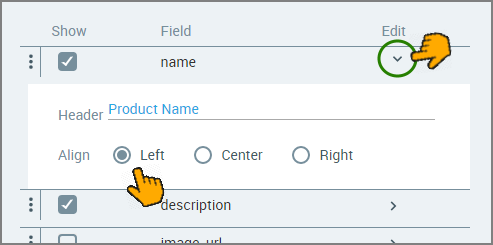
In the Header field, enter a friendly name for the field. This name will be displayed in the choices list during runtime.
If desired, set the alignment of the field's value by selecting the Left (default), Center or Right radio button.
Configure the validation and security settings. If relevant, select the Required Field checkbox and/or the Do not audit the question's answer checkbox. For more information, refer to Choice Question Design: Basic Workflow.
The Show/Hide Rule field enables you to show or hide the input question during runtime if a specified Rule condition is met. (An input question is always displayed by default.) To add a Show/Hide rule, click the Plus
icon and enter the condition to meet using the Rule Editor that appears:After adding the condition, select Show or Hide from the dropdown menu at the lower right to set the question's display status. To delete a Rule, click Delete rule at the top right corner of the Rule Editor.
For more details and an example, click here.
The Question Name field stores the runtime response as a User Input variable in order to make it readily available to other Flow elements. (For details on using choice selections in variables, see Using Choice Selections in Other Elements.) A unique name is automatically assigned by default, but you can enter a more descriptive name of your own.
To save your changes, at the lower right corner of the Page Editor, click Create Page (or Update Page). The Page Editor closes, and the Flow Map is displayed.