Menu Pages: Building a Two-Level Menu
A Two-Level Menu provides a quick way to design a Choice question that presents two or more categories of choices to a customer in two tiers.
With two-level menus, the choice list is split into categories, making it easier to organize and navigate multiple or nested choices. When the Flow is presented, only the first category is expanded to display its Choice options, while additional categories are shown unexpanded. To reveal available Choices, the customer selects a category.
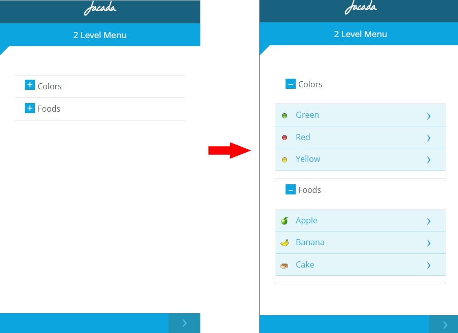 |
Selecting a Choice immediately presents the next page of the Flow to the customer (that is, there's no need to click Next after making the choice).
A category must contain at least two choices. Choice lists in Two-Level Menus are always built using static (manually-entered) values.
Note
The Simple Menu option, which was available here prior to Release 8.8, is now part of the Choices element. Use the new List of Buttons or Buttons Matrix Display format options to duplicate this functionality. For details, see Choices.
Creating a Two-Level Menu
At the top left of the Flow Map, click the round Add Steps icon. The Add Steps Toolbox opens.
From the UI Elements group, select and drag the Two-Level Menu element to the desired location on the Flow Map. The Two-Level Menu Editor opens, with default Element settings displayed:
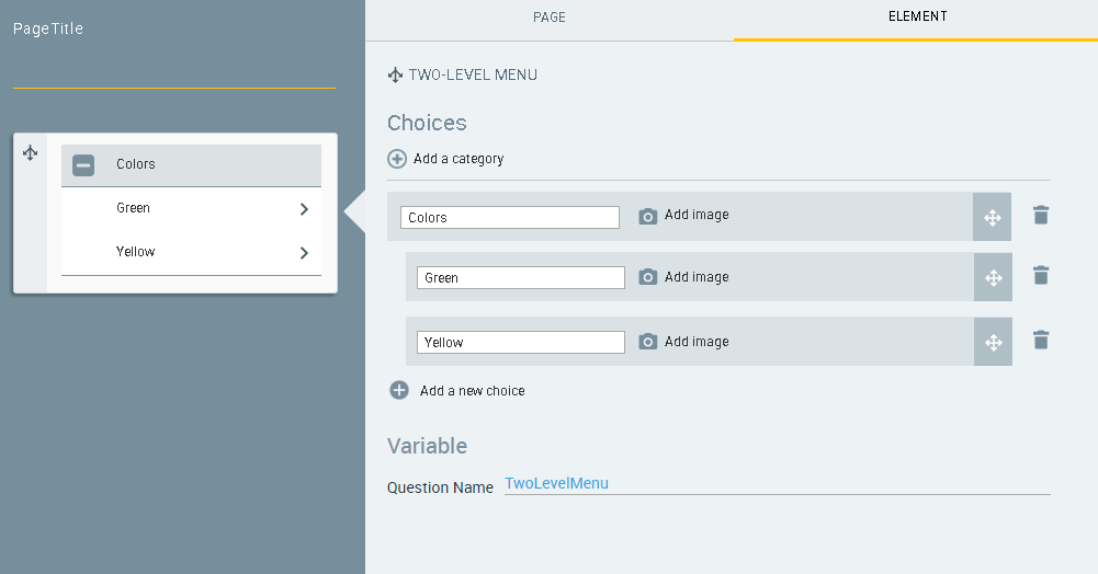
In the Choices section, replace the default category name (Colors) with a name that is appropriate for your category. Then, in the rows of choices, replace the default answers (Red, Green and Yellow) with relevant labels.
To assign an image for a choice, click the Add Image
 icon. Then, select the image you want from the Insert Image dialog and click Use Image to assign it. A preview of the image appears in the row, in place of the Add image icon.
After you have added an image to the choice, you can click Edit image to change or clear your image assignment.
Note
The X-Designer supports inserting images that are stored on the X‑Platform Server in a dedicated Image Library. For details about how to add images to your Library using the X-Console, refer to Managing Your Image Collection.
Create additional choices for your category, as needed:
From below the choices list, click the Add a new choice
 icon. A new blank row is added to the choices list and to the Page map.
In the new row, enter the text of the new choice. The new choice is automatically added to the Page map.
Repeat the above Steps until the choices list is complete.
To add a category, click the Add a category
 icon. A new category section is added to the Element tab.
Enter a name for the new category. Then, add new choices to the category, as described in Step 4 and Step 5.
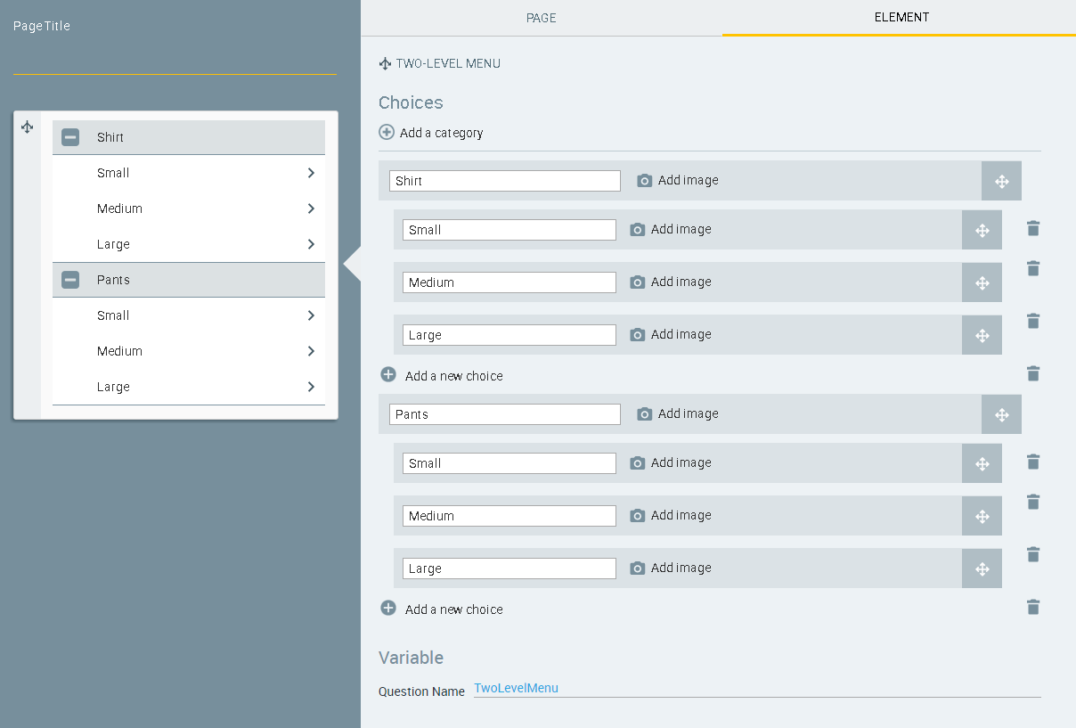
Arrange the categories and choices in the desired order. Use the
 icons to drag the categories and/or choices into the required order.
The Question Name field stores the runtime response as a User Input variable in order to make it readily available to other Flow elements. (For details on using choice selections in variables, see Using Choice Selections in Other Elements.) A unique name is automatically assigned by default, but you can enter a more descriptive name of your own.
Click the Page tab, and define the page settings as required. For details about the Page tab settings, click here.
When you finish, at the lower right corner of the Page Editor, click Create Page (or Update Page). The Page Editor closes, and the Flow Map is displayed.
To provide additional instructions or text before or after your choice lists, you can add another Page step to display a Paragraph element. For more information, refer to Paragraphs: Show Information to Your Customers.