Using Themes in Your Applications
By default, X‑Platform Applications are configured with the following built-in Themes:
Application Channel Type | Theme |
|---|---|
Agent Application | flat-agent |
Agent AI Assist Application | agent-ai-assist |
Mobile Web | Floating |
Web Self Service | Breadcrumbs |
Agent Assistant Customer Assistant | Chatbot |
Login | Interact-login |
Additional 'out-of-the-box' Themes are available as described below.
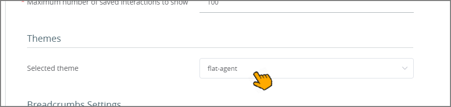
Selecting an Application Theme
The look-and-feel of an application at runtime is determined by the Selected theme setting of the application's Client Settings panel.
 |
Mobile Web Theme Options
The following Themes for the Mobile Web application, provided out-of-the-box, enable you to select the most appropriate look and feel for your organization's Flows:
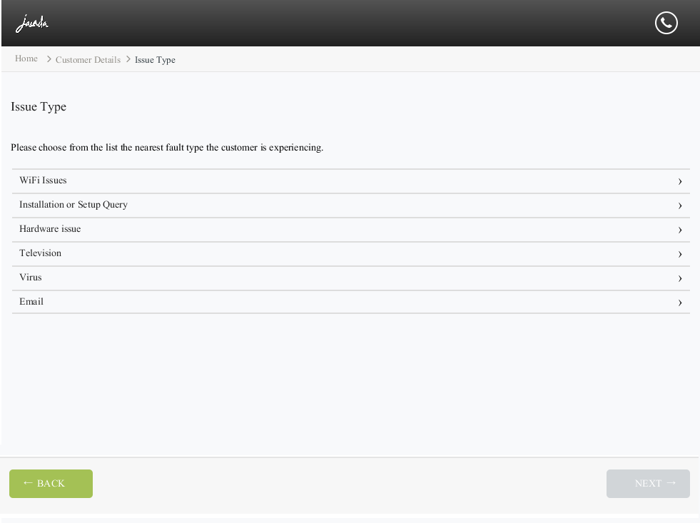
Theme A (Flat): This Theme provides the option to incorporate your company logo in the top level bar. The navigation buttons (Next and Back) and the customer assistance icons (Help and Contact Us) are part of the menu bar at the bottom of the page. | 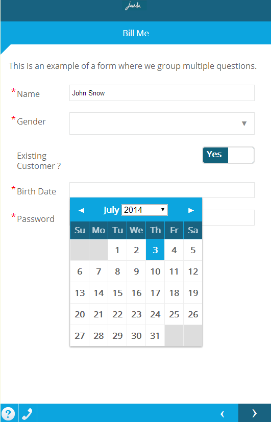 |
Theme B (Floating): This Theme offers a top level bar and a menu bar with a floating effect. The navigation buttons and customer assistance icons are larger and bolder than those in Theme A. | 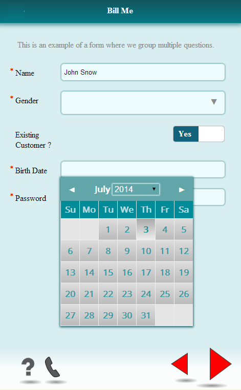 |
Theme C (Rounded): This Theme offers a top level bar with a rounded effect, and navigation buttons at the top of the page. The customer assistance buttons are located in the menu bar, at the bottom of the page. | 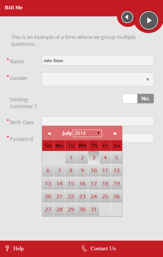 |
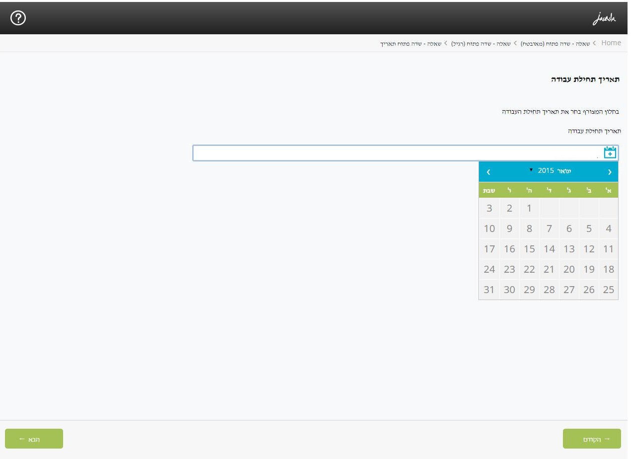
Flat-Mobile_RTL: This Theme, which is based on the Flat Theme, was developed specifically to support proper display of Flows in right-to-left languages, such as Hebrew and Arabic. | 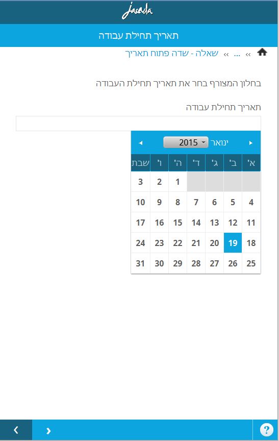 |
Web Self Service Theme Options
Although a large selection of default themes for the web applications is offered, the Flat Theme and the Breadcrumbs Theme are most recommended for an aesthetic and usable look and feel to your Flows. Both themes support a company logo at the top, and feature the Contact Us button at the right upper corner of the page.
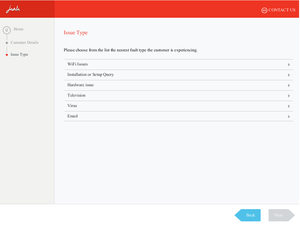
Flat: This Theme displays the breadcrumbs trail in a horizontal bar at the top of the page. The Back and Next navigation buttons are located at the lower left and lower right corners of the page, respectively.
Breadcrumbs: This Theme features a separate frame for the breadcrumbs trail, at the left side of the page. The breadcrumbs bar is displayed vertically. The navigation buttons (Next and Back) are located at the lower right corner of the page.
flat-web-rtl: This Theme, which is based on the Flat Theme, was developed specifically to support proper display of Flows in right-to-left languages, such as Hebrew and Arabic.
Selecting a Logo for a Theme
The X‑Platform supports adding a company logo to an application Theme. The logo is defined per Theme, so if needed, you can upload different logos for different Themes.
The selected logo for a Theme is displayed on the Logo tab of the Theme:
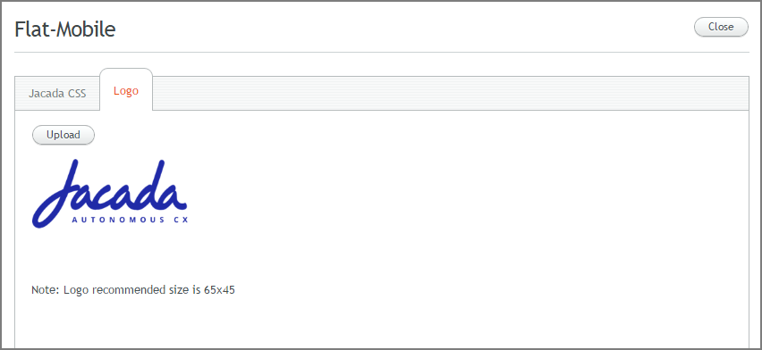 |
If no logo is defined for the Theme, the Logo tab is empty.
Note
Only a user with Admin or higher role is able to set Theme logos.
From the Resources menu of the X-Console, select Themes. The Themes page opens.
Click the name of the desired Theme. Then, at the top of the page, select the Logo tab. The Logo panel opens.
Click Upload. From the Open dialog box, navigate to the relevant graphic file, and click Open. The selected logo will be displayed in the panel.
Note: Supported file formats are .JPG, .GIF and .PNG. For best results, it is recommended to upload a logo of 65 x 45 pixels (or smaller).
To return to the Themes page, click Close.